I’m going to be honest, gathering and analyzing statistics is not my favorite way to pass an afternoon. I’m much more of an abstract creative thinker who can spend hours pouring over philosophy theories or days nose-in-book reading about history and art. When it comes time to really get into the numbers though I usually find myself quick to boredom. Don’t get me wrong, I fully appreciate the power and knowledge that lies in data sets or analytics. I’ve seen “number people” transfixed by the contents of a spreadsheet and even listened with the utmost respect to their impassioned explanation of a statistical regression. It’s just that, when left to my own devices, I usually skip over the data heavy parts of articles or texts. Professionally this is seldom an option, which is why I’ve decided that 2010 will be the year I really embrace numbers.
With every article I write and presentation I create I realize that by foregoing in depth – or in some cases any - statistical support I am doing my theories and observances a disservice in two major ways: first, I’m ignoring a large portion of my audience who are “number people;” second, I’m not providing the full case in support of my theories/assertions. So, I’ve begun to seek out resources for cost effective informative reports, data laymen and fine examples of stat applications to start expanding my use of numbers. To keep the learning going I’ll be sharing my number lessons with you over the next few months.
To ease my way into this new way of thinking I decided to start where art and numbers meet, in the world of “infographics.” The practice of using graphics to represent collected data sets has grown in popularity as we’ve become an increasingly image oriented culture. As graphic icons have been standardized and the practice of graphic design more standardized(w/c). Combining simple visuals with assorted number sets has proven to be a very effective way to serve a number of purposes. Among the more successful uses I have found include:
Using imagery to emphasize quantity or the relationship between comparative data.

The growth of Crayola colors since their introduction
*from http://flowingdata.com
To present an alternative perspective on information.
 A visual interpretation of the information held in bar codes
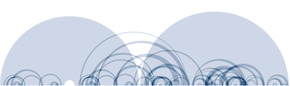 A plot of Bach's Three Goldberg Variations
*from The Shape Of Song
See also: A Visual History Of The US
Use numbers to dictate the direction of a piece of art.
 A map of a website's traffic.
*from http://designweenie.com
Clearly these aren’t the pie charts and bar graphs of yore but they can be found in many of the same places: reports, slide presentations, textbooks etc. As the design quality of these representations have become more intricate and informed they have evolved into standalone pieces of art. The melding of the world of art with the realm of numbers is a very encouraging place to start this exploration and I’m looking forward to finding out where else it shall lead.